Little Things, Big Results: How Design Shapes Engagement
Your audience doesn’t see what you show them - they see what their brain tells them. That’s why the smallest design elements often decide whether or not communication connects.
Psychologist Richard Gregory’s visual perception theory suggests that people don’t simply see what's in front of them, they interpret visuals based on prior knowledge and context. This means that even subtle design elements like headings and font can alter the way a message is understood.
As a UGC creator, I’ve seen this play out firsthand. I once worked with a startup launching a wellness supplement where the original video struggled to gain clicks. After reviewing performance, we made one small change - adding a bold text headline to set key expectations from the beginning of the video:
“Spend the morning with me”
Health + Wellness Focused
That single design tweak shifted the tone from passive to engaging and just like that, watch time and shares spiked.
MORE EXAMPLES
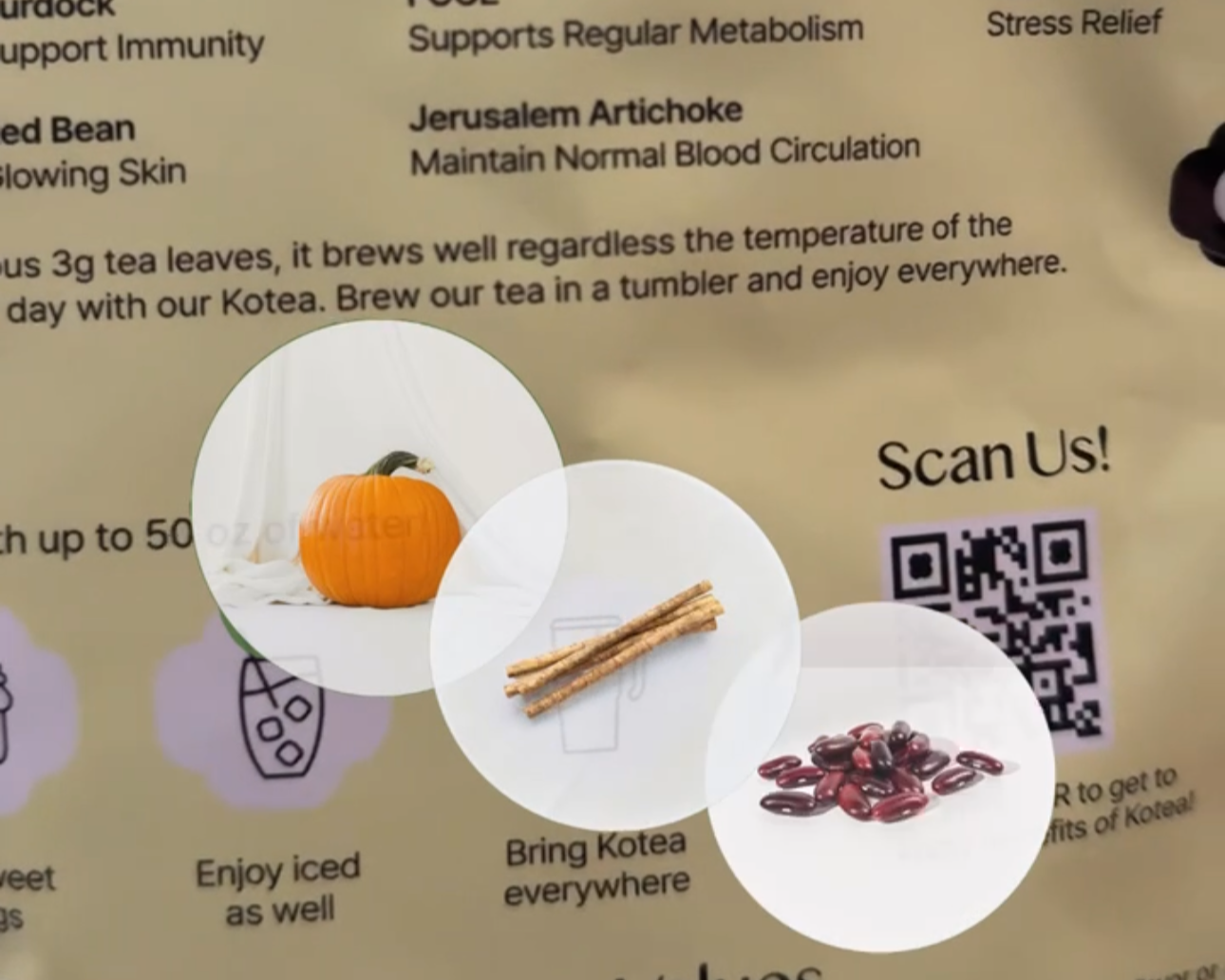
INGREDIENT VISUALS
Helps viewers interpret and connect what the voiceover is saying with what they see.
By pairing spoken words with visuals, I reduced ambiguity. Gregory’s theory reminds us that viewers connect more strongly when concepts are being visually reinforced.

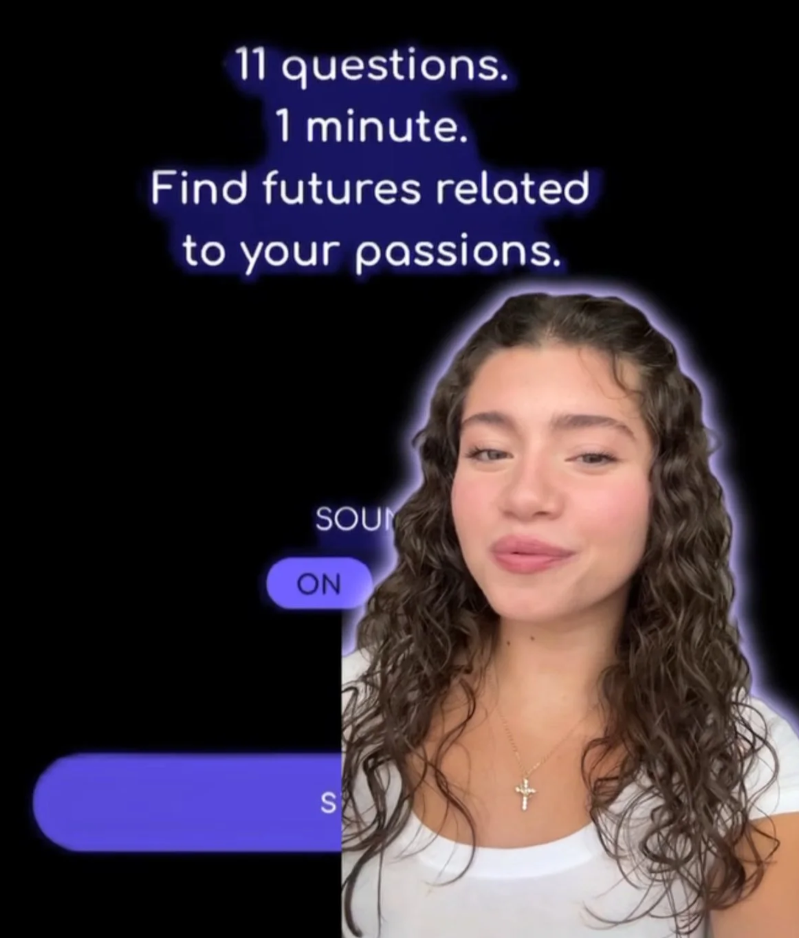
COMBINING TEXT HIERARCHY
BOLD = Emphasis
EMOTIONAL CUES = Emoji
Pairing typography with symbols reinforced interpretation. The bolded word and emoji shaped not just the message, but the emotion behind it.
Color also plays a role. Thomas Sanocki and Noah Sulman’s color relations experiment showed that harmonious color combinations improve recall. Reducing color complexity and sticking to one color scheme builds not only aesthetics, but memory and focus. A UGC creator who stays aligned with brand colors is more likely to produce content that feels cohesive and lasting.
Color harmony doesn’t just apply to objects. It applies to design accents too. Matching the glow line with the quiz text color tied the content together, making the video more memorable.
Small design elements don’t just decorate communication; they determine whether your message connects at all.
For marketers, the lesson is simple: don't underestimate the details. Here are a few tips I share with brands I collaborate with:
-
Switching fonts weakens brand identity and may cause confusion.
-
A/B test thumbnails, overlays, or color palettes to see which resonate most.
-
Three to five words.
-
They humanize a message and clarify tone.
We often mistake “the big idea” to be what makes marketing successful. Brands that pay attention to those tiny design decisions are shaping consumer behavior at a psychological level.
Every font, color, and symbol tells a story. It’s just your job to tell the right one - try it out in your next video!